Amuseum: A tour check-in app for an art museum

Concept Project  +   Branding Design  +   Mobile App Design  +   Responsive Website Design
Project Background

01

Amuseum is a tour check-in app for its museum that allows users to buy tickets for themselves and others, make a reservation for tours, or simply use the phone as a guide within the museum. Museum tours are expensive, time-consuming, rushed, and crowded therefore it is frustrating for art enthusiasts. Amuseum offers a visually pleasing way to experience art for all visitors of Amuseum and allows users to find cheaper, flexible tours where our users feel motivated and comfortable with their experience.

  • Duration
  • Between May - June 2022, approximately 4 weeks
  • Role
  • UX/UI Designer, designing the app for Amuseum from conception to end product.
  • Responsibilities
  • Concept, user research, wireframing, prototyping, usability studies, accessibility, designs.
  • Company
  • Concept Project for UX Designer Course by Google
Challenges
  • Create an easy and efficient way to buy tickets and check in.
  • Design an affordable and flexible tour experience.
  • Manage crowdedness within the museum.
  • A review system for future visitors.
User Research

02

I have conducted user research on five people to understand struggles of visitors of art museums. This research confirmed that general struggles align with my assumptions. Overall, I have discovered four main pain points: tours are expensive, crowded, rushed and doesn’t allow freedom to the experiencers because of the time limits.

Expensive

Tours with a guide are too expensive sometimes, and in some cases, it is the only option to follow.

Time-Consuming

Visitors struggle with managing their time to align it with tour reservations. It is hard to find availability.

Rushed

Users feels rushed participating in tours because they have certain time period with each artwork.

Crowded

Most visitors feel overwhelmed of crowded spaces especially after pandemic.
Mobile App Design

03

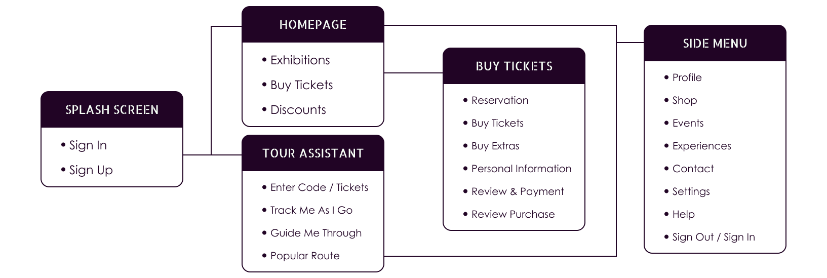
Information Architecture
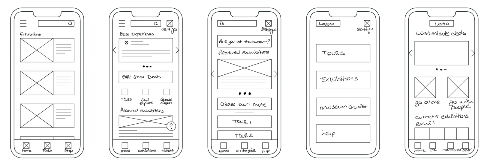
Paper Wireframes
Digital Wireframes
Homepage

My goal was to create a platform for a certain museum for users who needs to save time & money, and to create flexibility to avoid crowdedness and the rushed feeling.

Tour Assistant

Tour Assistant feature is to help people get cheaper guides and better experiences, without relying on anyone.

Usability Studies

I have conducted three usability studies throughout my design phase. The first one was to understand if I was on the right track in designing the low-fidelity prototype, and another one was to determine if I was able to solve the pain points that users experienced.

I expected to find answers to these questions:

  • How long does it take a user to get tickets to the museum?
  • What can we learn from the user flow or the steps that users take to Tour Assistant and check-in to a tour?
  • Are there parts where users get stuck or abandoned?
  • How easy or difficult was it to use?
Usability Study Findings
Low-Fidelity Prototype
Tour Assistant seems confusing

Users need more clear indications for Tour Assistant features and actions.

The tickets section need more detail

Visitors struggle with managing their time to align it with tour reservations.

Tickets need more customization

Users want to be able to put other people’s personal information and customize tickets.

Usability Study Findings 2
High-Fidelity Prototype
Crowded ratio visualization was confusing

Users were skeptical about the meaning of lines under the dates.

Buying tickets as a member could be easier

Users suggested that it would be easier if there was a way to save their friends and family if they were going frequently together.

Visitor Experiences needs a filtering feature

A user suggested that it would be easier to find the specific information they are looking for if there were a way to filter reviews on Visitor Experiences Page

Responsive Website Design

04

This part holds my second project of UX Designer Certificate Program.
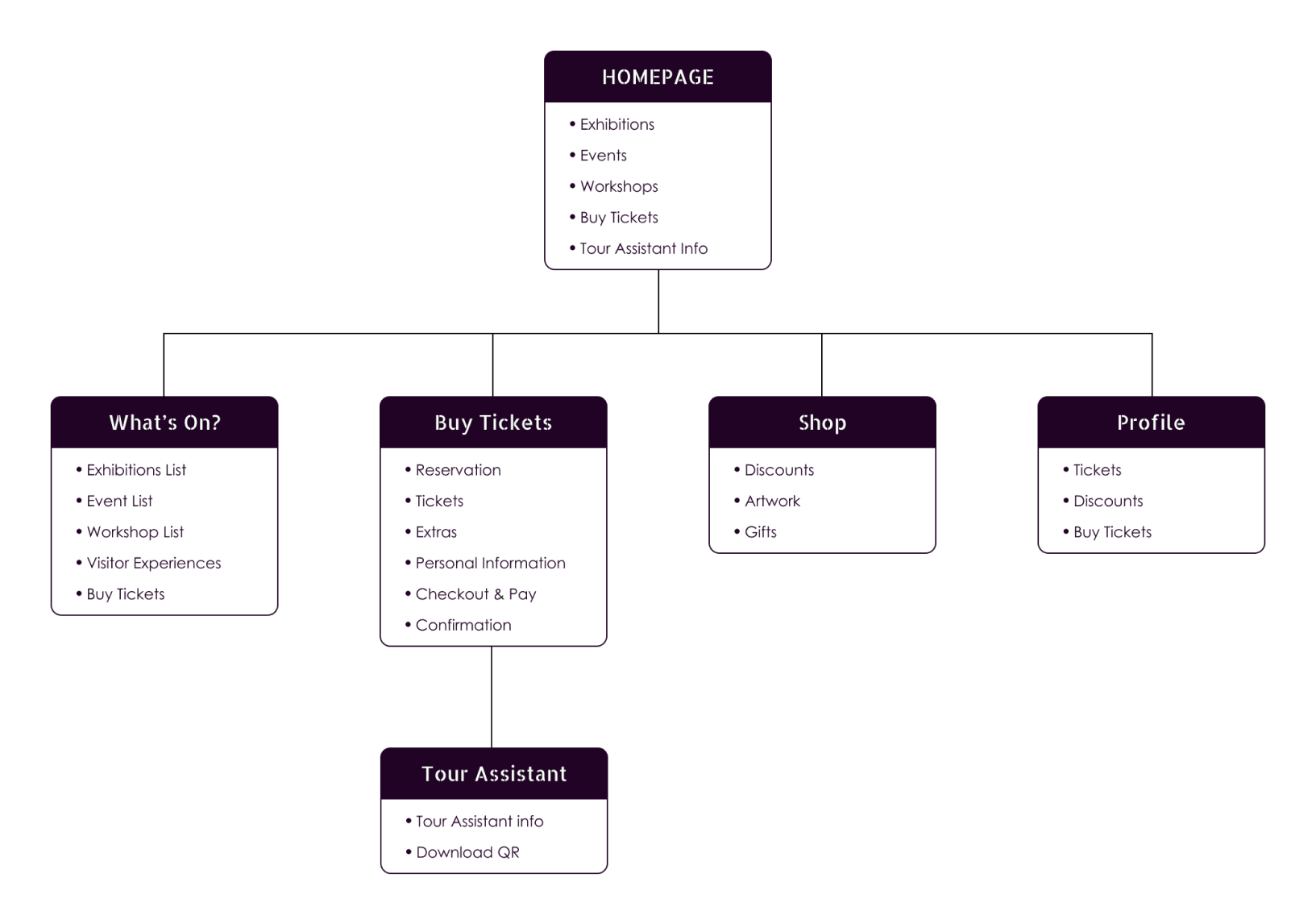
Site Map
Paper wireframes
Usability Study Findings 3
Low-Fidelity Prototype
It is unclear how to go back & forth

Users were confused to understand how to go back and forth.

Date & Time needs to be added on payment screen

Users felt the need to check date & time they are reserving one last time.

Friends feature should be added for convinience

Users suggested that it would be easier if Friends feature added for website as well.
Accesibility Considerations
High Contrast Color Selection
Audio & Transcripts Options
Icons & Multi-Lingual App
Clear & Legible Design
Challenge 1
Create an easy and effiecient way to buy tickets and check-in.

As an active museum, I wanted to create a familiar experience meanwhile introduce an easier path for regular visitors, where they can easily fill out necessary information.

Challenge 2
Design an affordable and flexible tour experience.

With the Tour Assistant feature, visitors can explore without a guide. Information is provided in audios and transcripts, allowing art enthusiasts to wonder within the museum however they please.

Challenge 3
Manage crowdedness within the museum.

Visualizing crowded ratio aims to tell users how crowded the museum will be as the first step of buying tickets. This allows people to freely choose to experience however they want.

Challenge 4
A review system for future visitors.

Amuseum has a lot of activities throughout the year. Visitors who have arrived can leave reviews in the app to inform future visitors about their experience. This feature allows future visitors who need information can search through the page accordingly.

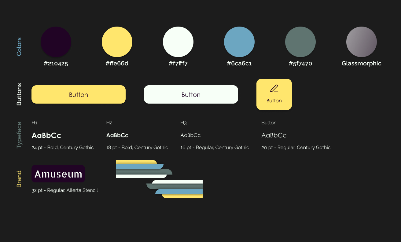
Style Guide
The dark-themed color scheme is chosen to control the screen light that is emitted from people who are using the app within the museum, meanwhile, high contrast and the typeface allows content to be clear and legible. While dark purple adds respect and a serious tone to the museum, the secondary color yellow adds a playful tone to the app. The green and blue were added to the brand design to symbolize versatility within the art world.
responsive priview
This is exactly what I need
as a regular visitor. The app is fun and easy to use. I wish the Tour Assistant was available to every other museum.
Usability Study Quotes, Participant E
what I've learned
While I was designing, I realized that you have to listen carefully to the users, because their experience can give you new ideas, and better adjustments to meet their needs. Usability studies and peer feedback influenced each iteration of the app’s designs.
Process Deck